Project 02, Gnohome
Real Estate Property Search
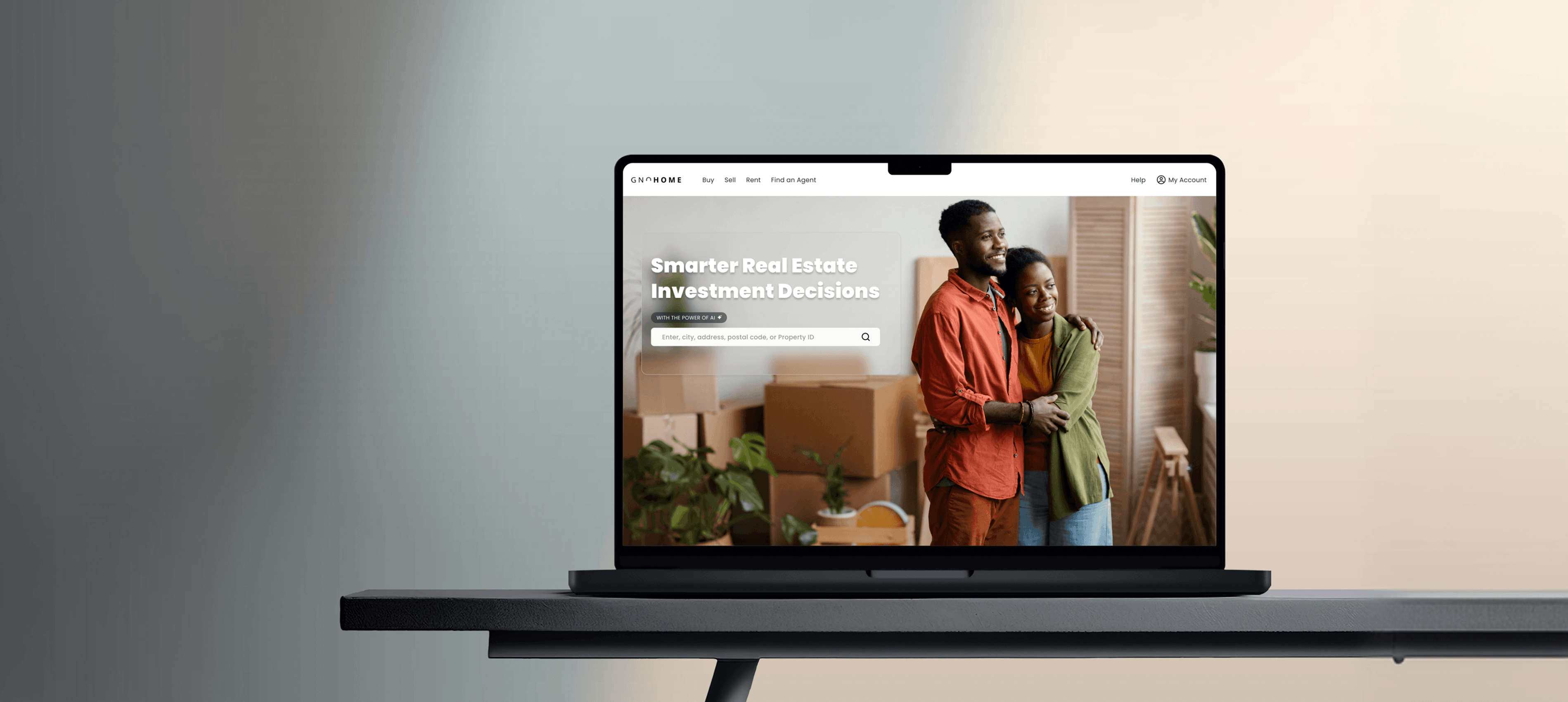
Redesigning Search for a Real Estate Marketplace Platform, turning a cluttered, frustrating property search into a seamless, trust-building experience.
01, Overview
A Platform Built for Listings, Not for People
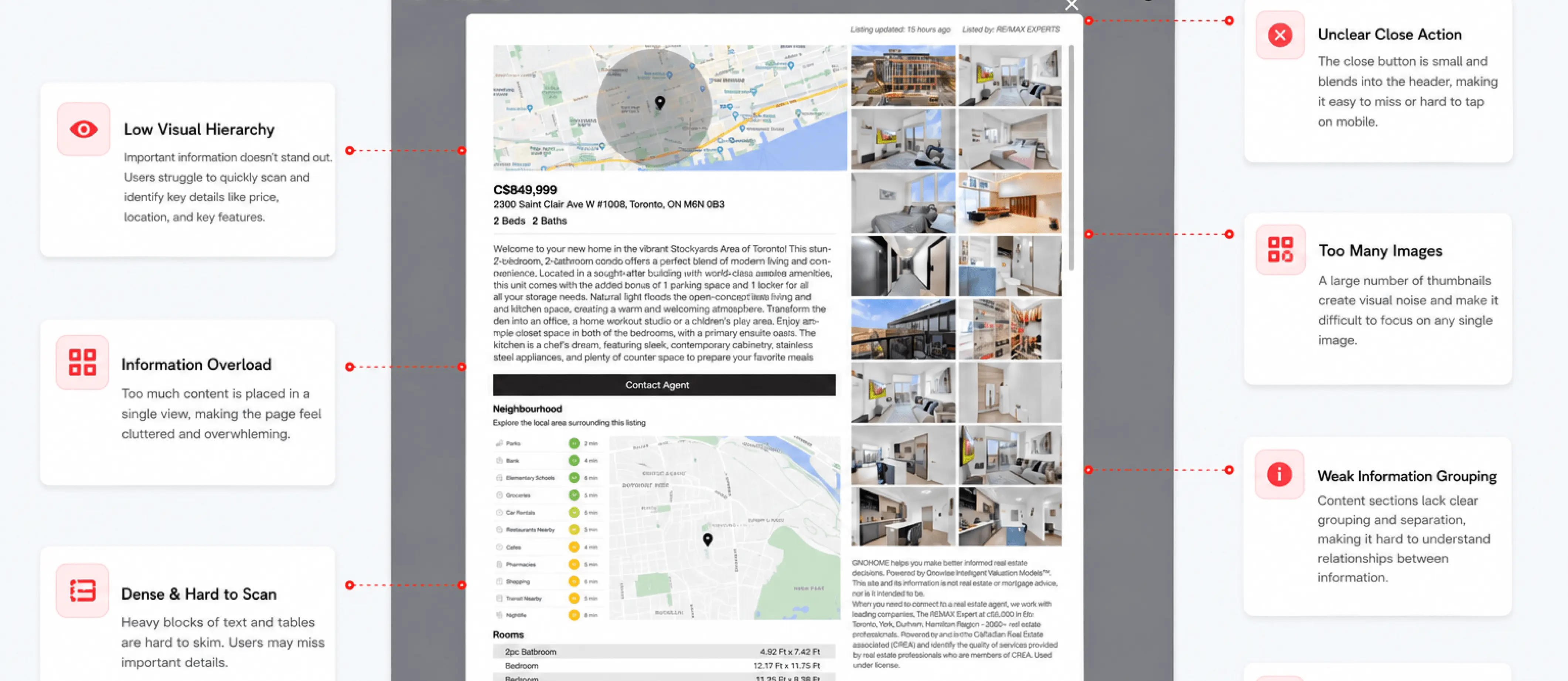
Gnohome had the inventory but not the experience. Despite an extensive property catalogue, engagement and conversion were stalling, because the platform was built around listings rather than the way people actually search for a home. Filters were too broad, listings were inconsistent, and trust eroded at exactly the moment users were ready to act.
As Design Lead in a cross-functional team of nine, I owned the design direction from the first research question to final handoff. I led the rebrand and the new design system, established research and design operations, mentored the design team, ran cross-functional workshops, and designed key features hands-on.
02, The Problem
Navigating Frustrations in the Home-Buying Journey
I ran research with 150 participants that surfaced three recurring pain points quietly destroying engagement. The goal became clear: redesign the platform to enhance usability, improve search and filtering, and simplify the inquiry process.
65%
reported difficulty finding relevant properties due to limited filter options
55%
found navigation unclear, causing them to abandon their search early
40%
expressed frustration with inconsistent property details, reducing trust
Inconsistent Property Information
Property information quality and completeness varied widely across listings, causing trust issues and user frustration. Users couldn't rely on the data they found, making them hesitant to reach out to agents or commit to viewings.
Complex Search & Filtering
The existing search and filtering options were complex and less user-friendly, resulting in confusion and reduced engagement. Users needed advanced filtering, predictive search, and real-time updates to find what they were looking for.
Limited Mobile Responsiveness
60% of traffic was mobile, yet the experience was slow and non-intuitive. Users encountered broken layouts and unclear navigation, directly driving higher bounce rates and limiting engagement.
03, The Solution
Search Built Around the Home Seeker
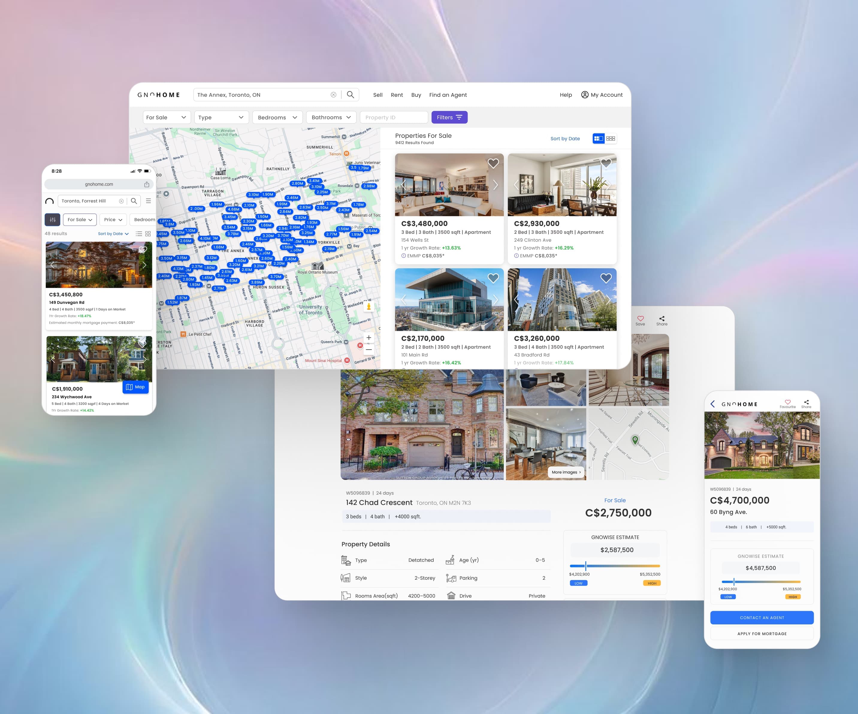
I anchored the redesign in Aaron Walter's hierarchy of user needs, functional, reliable, usable, pleasurable, and sequenced the work to fix the foundations before adding delight. I ran collaborative sketching sessions with design, engineering, and product to co-create a contextual search experience accessible seamlessly from any page.
Decisions I Made
Criteria-led filters over a single search bar
Why
Testing showed users arrived with specific, non-negotiable criteria. Structured filters let them narrow the field in one pass instead of refining a vague query repeatedly.
What I rejected
A Google-style single search bar tested as faster to build but pushed cognitive load onto the user and hid the criteria they cared about most.
Standardised listing cards with data-quality cues
Why
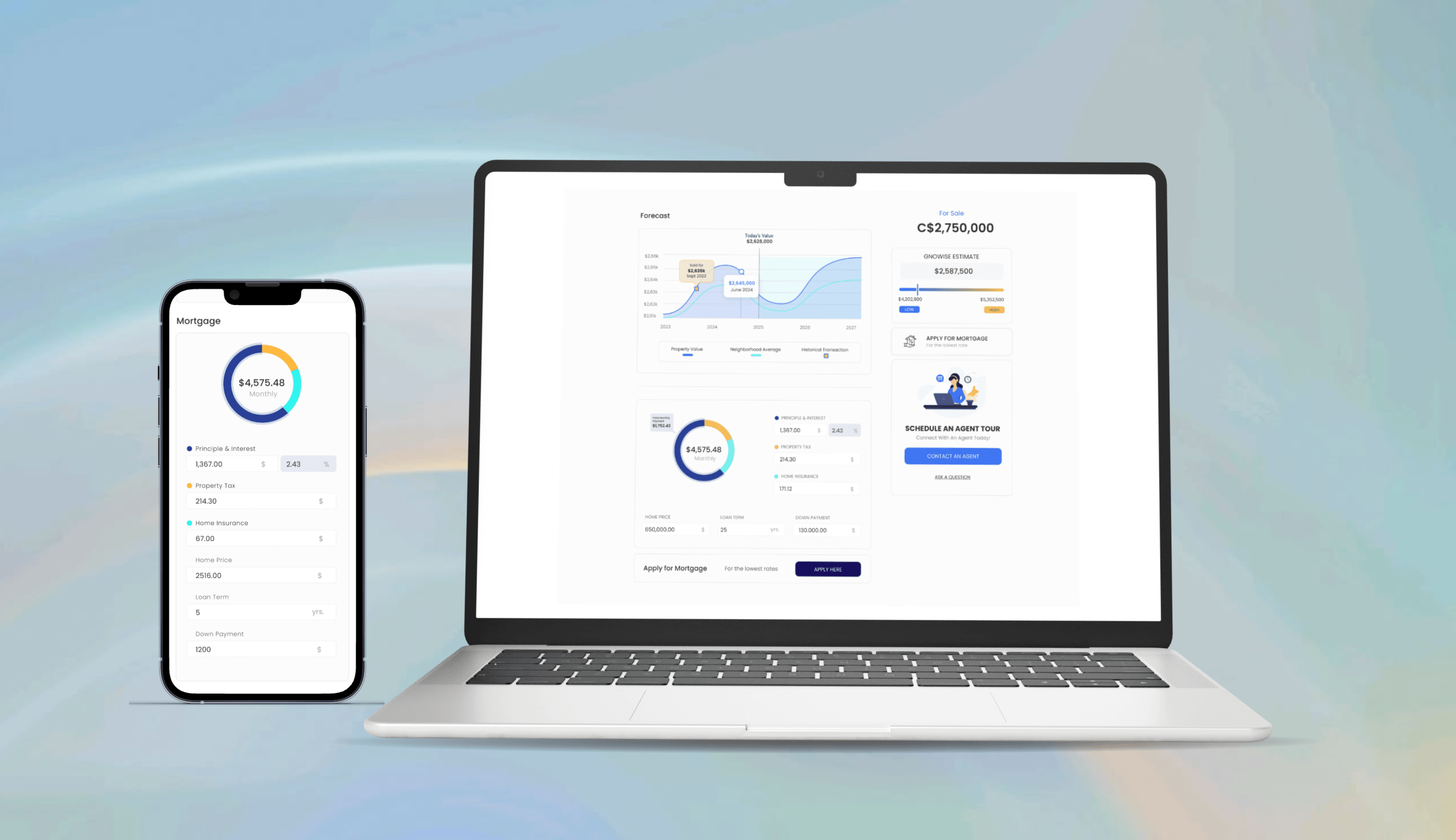
Inconsistent listings were the top driver of distrust. A fixed card structure made properties genuinely comparable and signalled which listings were complete and verified.
What I rejected
Letting agents style their own listings preserved flexibility but reproduced the exact inconsistency that was eroding trust.
Protect comparison over promoted listings
Why
The business wanted more promoted listings up front. I pushed back with the trust findings and reached a compromise that protected the comparison experience.
How Might We
“Simplify the property discovery process, making it more efficient and enjoyable for users?”
How Might We
“Refine search filters so users can precisely and effortlessly find properties matching their specific criteria?”
Functional & Reliable
A comprehensive UX transformation unifying the search experience, fixing broken flows and establishing consistency across the platform.
Accurate Property Discovery
Enhanced reliability through standardised, up-to-date property information with clear data quality indicators to rebuild user trust.
Intuitive Navigation
A user-friendly interface enabling easy navigation with streamlined filters, predictive search, and real-time updates.
Delightful Experience
Personalised recommendations, smooth micro-interactions, and contextual search, accessible seamlessly from any page.
04, Final Design & Outcome
A Platform That Works for Its Users
After launch, we tracked the results against the UX benchmarks I defined during Discovery. Criteria-led filters, contextual search, standardised listings, and real-time updates turned a fragmented catalogue into a search people can compare and trust.
19%
Rise in property inquiry conversion rate
29%
Faster relevant property discovery
11%
Increase in returning users
18%
Increase in average session duration
33%
Growth in mobile user engagement
40%
Surge in user feedback & ratings
Measured over the first 90 days post-launch versus the prior quarter, using product analytics and a post-launch user survey. Percentages reflect relative change from baseline.
“The recently launched Gnohome website received many positive responses from users, significantly contributing to the success of the business, the UX improvements elevated user satisfaction and positively impacted every key business metric.”